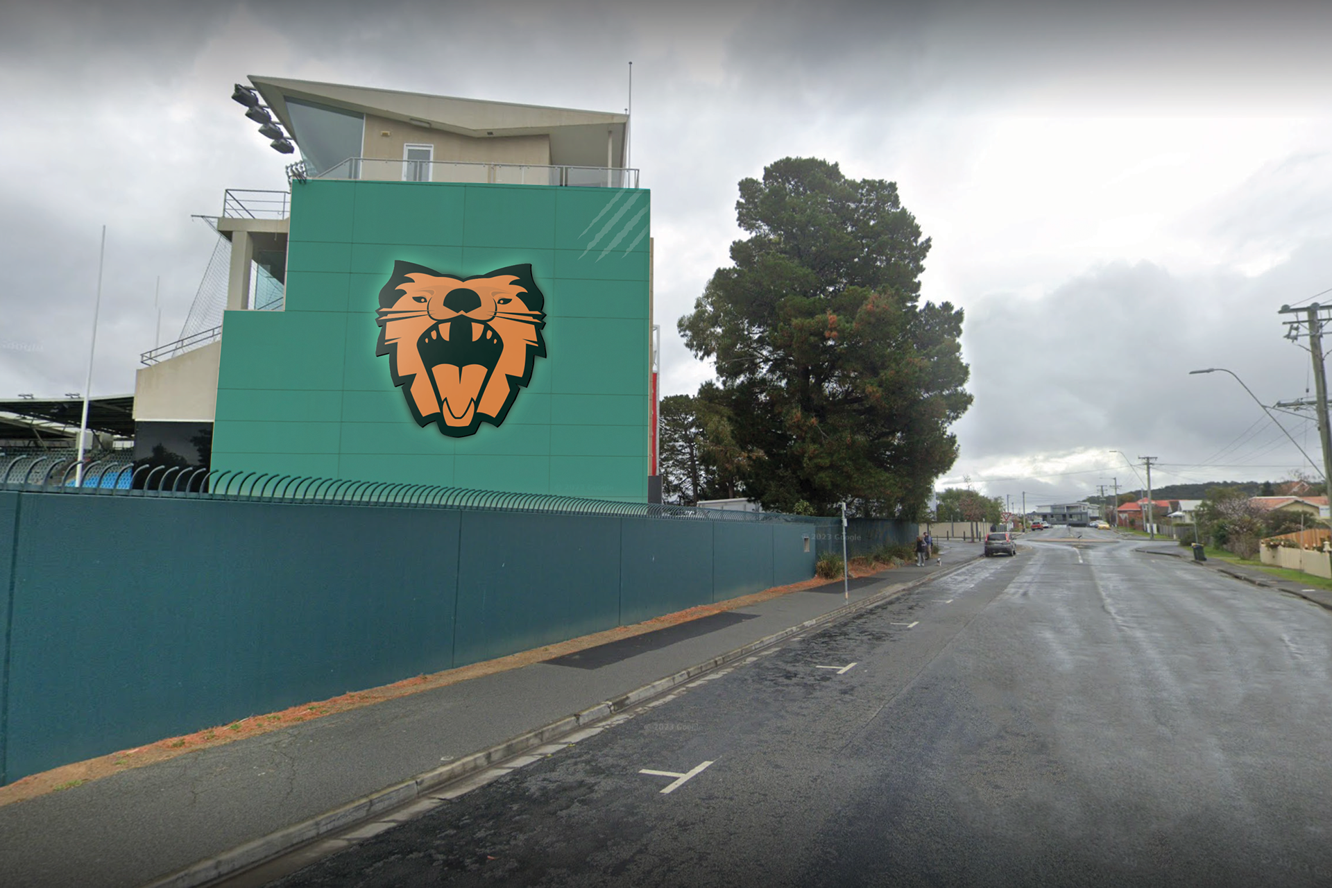
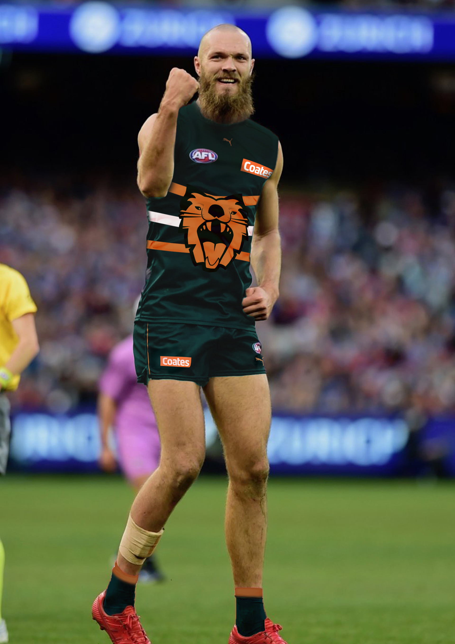
Focusing on vector linework, negative space and perspective illusion, my goal was to convey a fearsome, aggressive demeanor. The brandmark doesn’t just capture the Tasmanian Devils aggression, but also the eagerness the fans and players hold within Tasmanias sporting culture, as they have waited so long to finally be included within the AFL. This design was used as an opportunity to also reflect my personal interest toward the relationship between emotion & athleticism in design through this energetic graphic identity.

Here I have used the Devils fur pattern to inspire the kit design. The Devil has an iconic stripe just above its tail on its back and another stripe underneath its chest. The two white lines depict this fur pattern. I’ve included these to make a direct reference to its physical characteristics, to develop an iconic and memorable identity.
