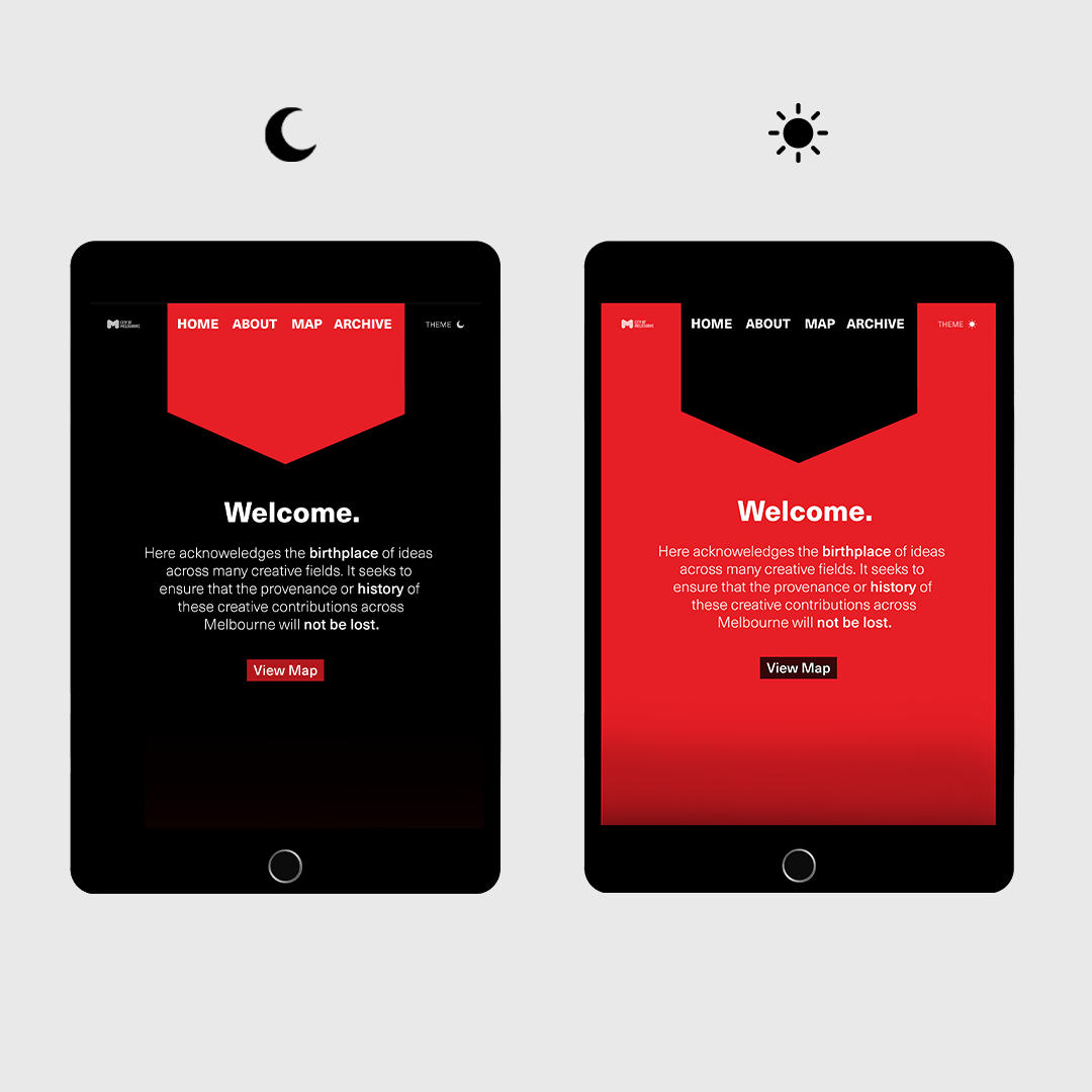
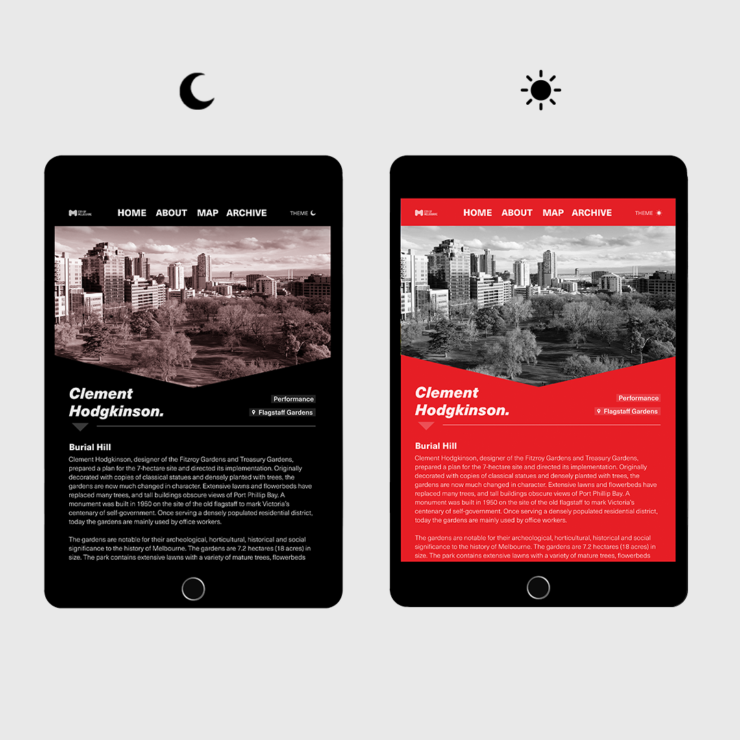
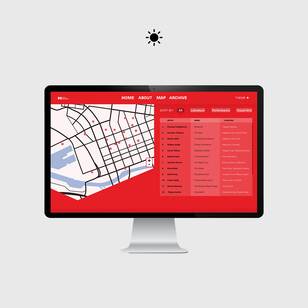
The goal of this project was to connect people with Melbournes history, and the H logo/markers would be placed in all relevant locations with information on them for people to read about.
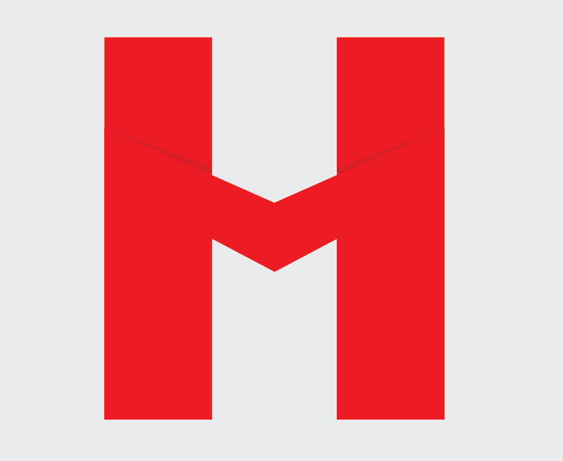
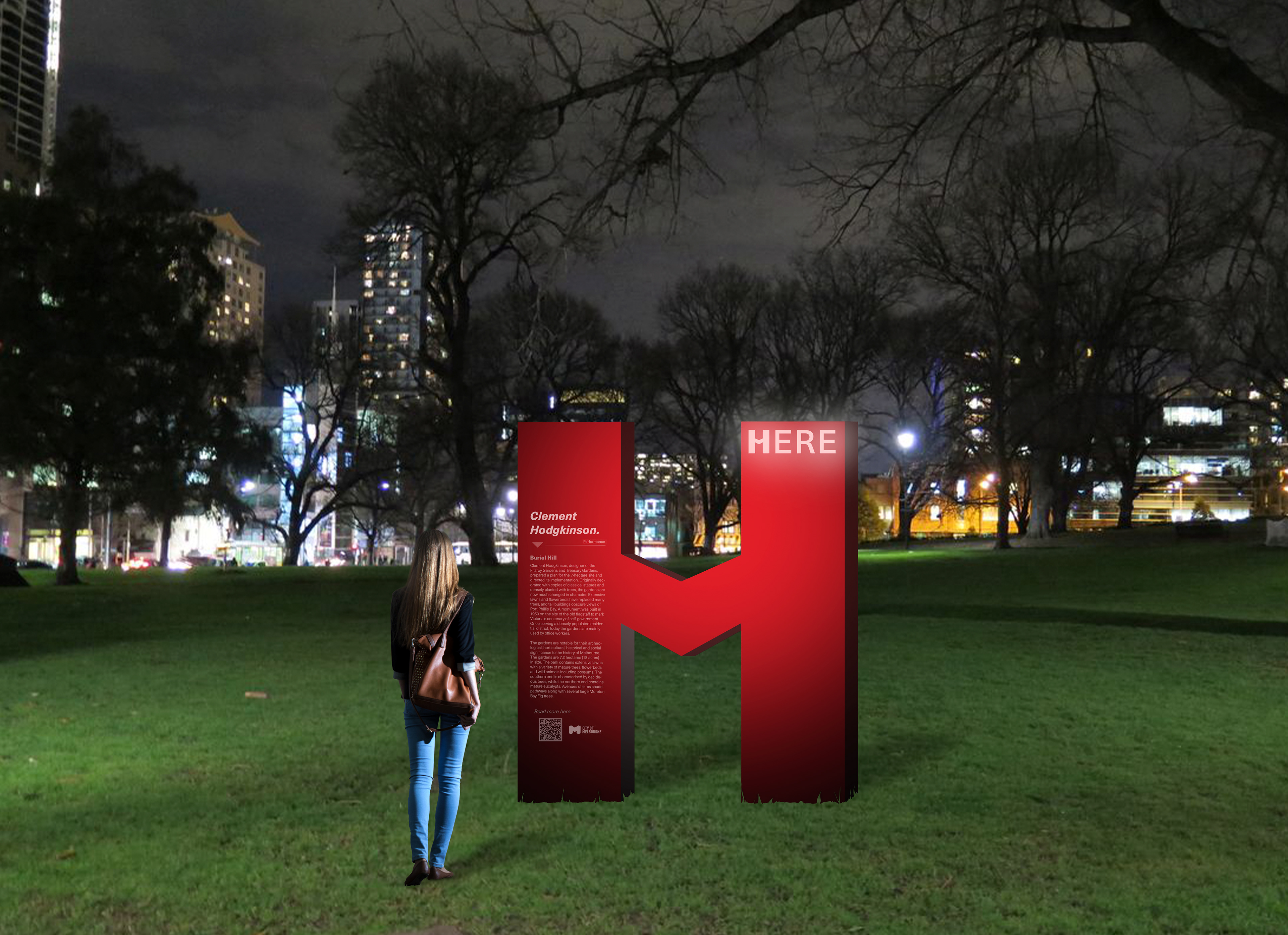
The marker of the H to represents the name ‘Here’ (the name of the project) using bright red to signify location and capture attention of the passer-by. My logo was built on two letters, being the ‘H’ and an ‘M’. The M is designed similar to the recognisable Melbourne logo. I have done this not just to show this project lies only in Melbourne, but also to use its cross bar to act as an illusive downward point almost speaking here the marker lies. This helps draw people to its location, and information present.

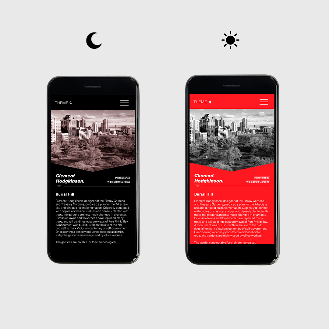

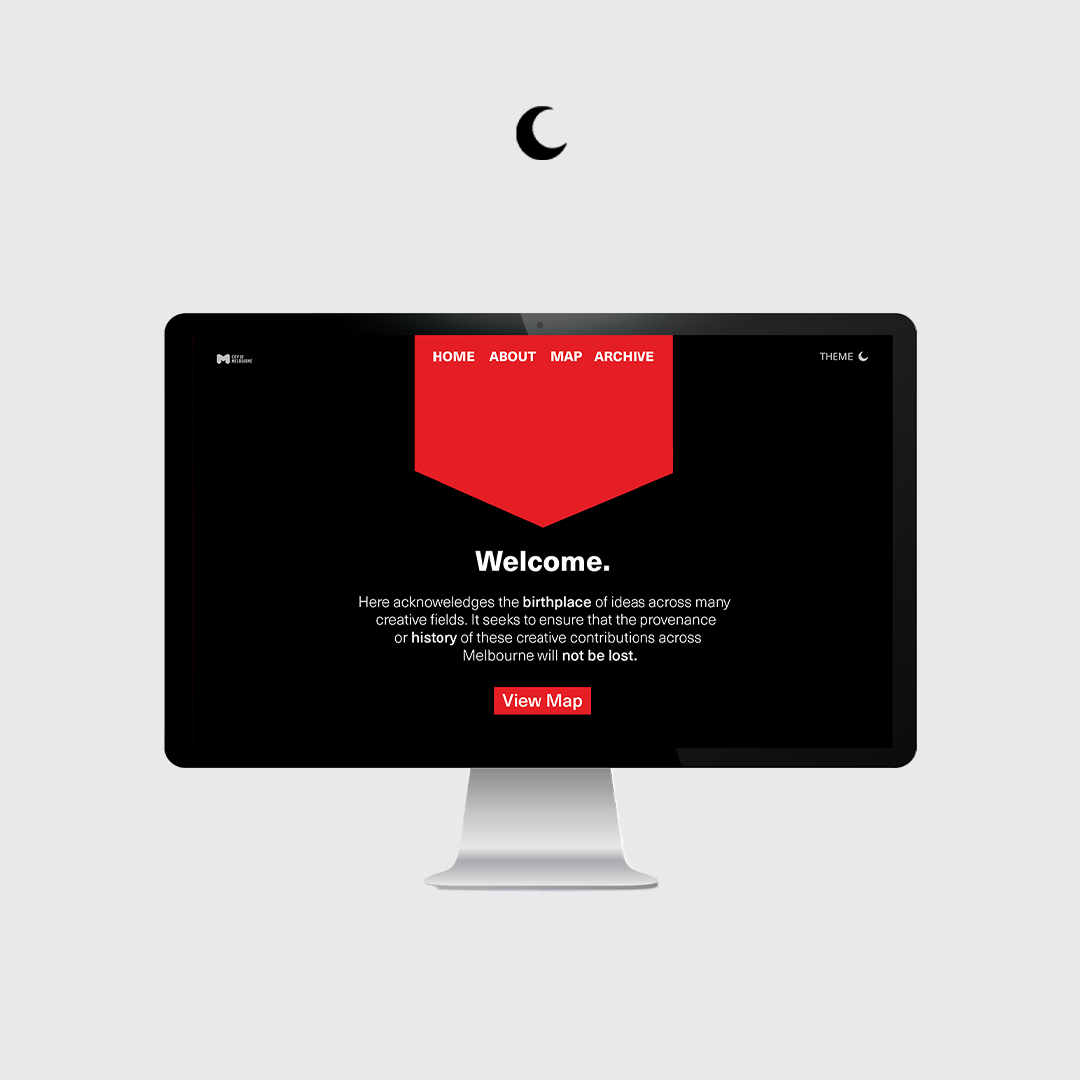
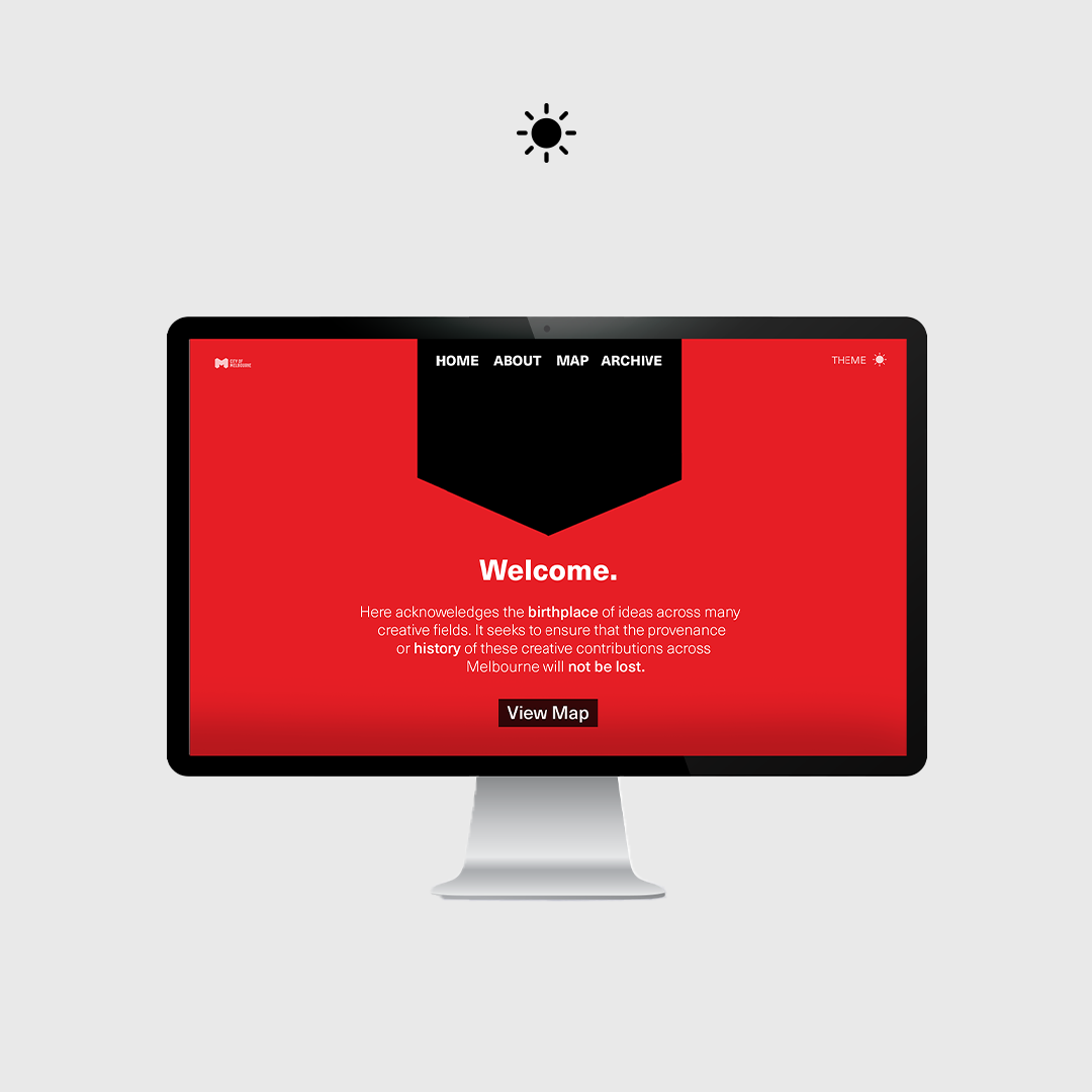
The website I designed featured both a day and night theme on all technological platforms with typography that was legible for both colour schemes. Avoiding a “safe” website design, I took a risk by utilising shape derived from my physical H marker to communicate a layout that portrayed a stronger sense of branding identity.
